

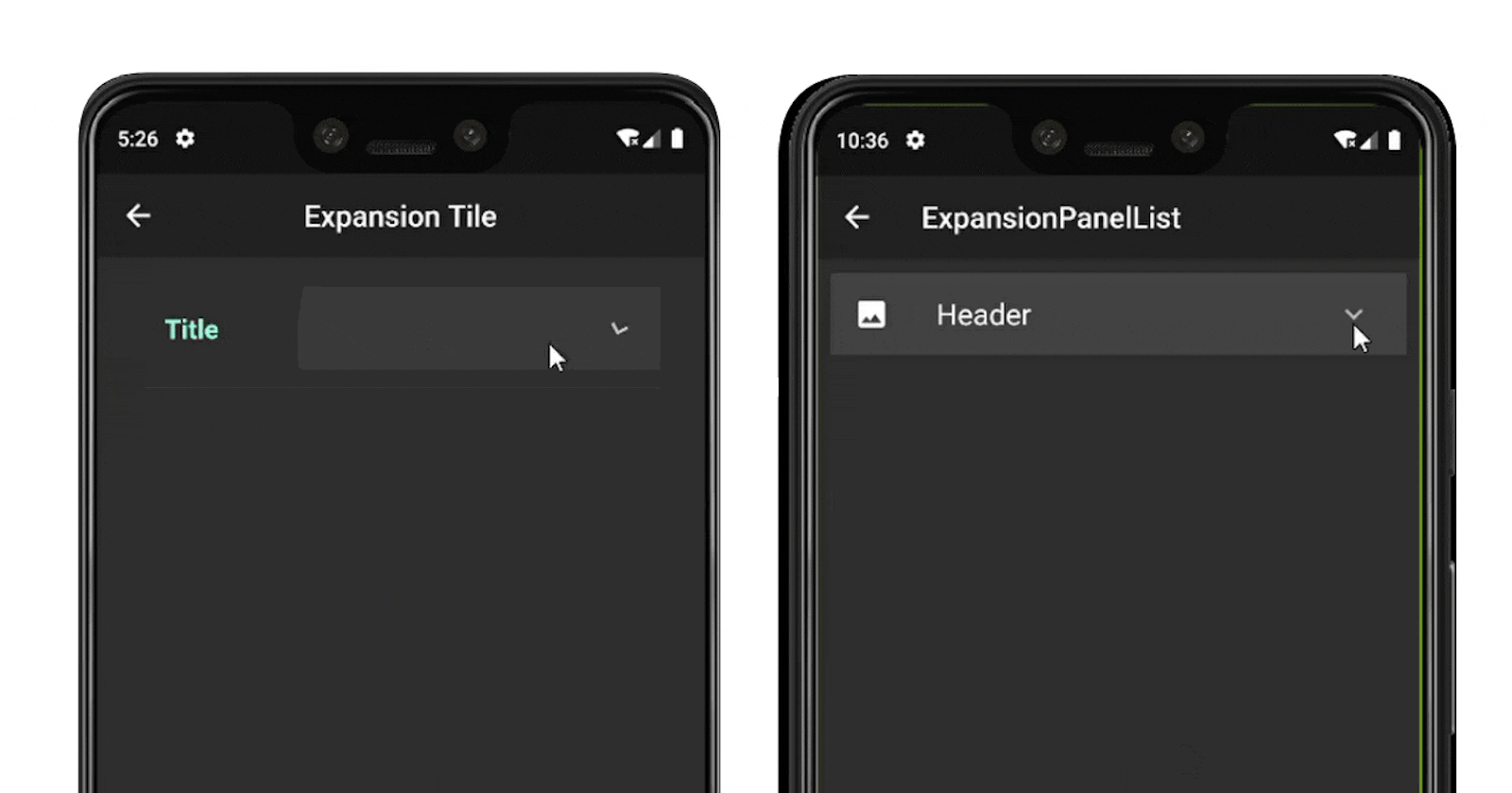


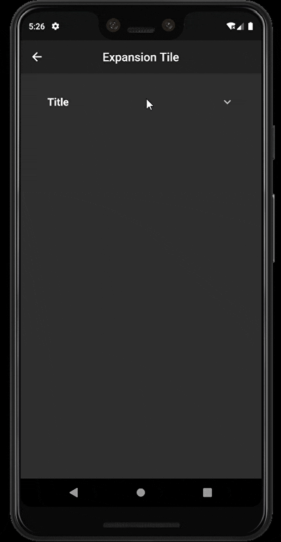
In many application, you have seen an expansion or a collapsed view like the above.
There are two ways of creating an expandable view in Flutter :
ExpansionTile
ExpansionPanelList & ExpansionPanel
So let’s start implementing it. First, you need to create a new flutter project with your IDE. If you are facing an error check this: Write your first Flutter app.
After creating your project delete everything within your main.dart file and write this:
import 'package:flutter/material.dart';

void main() {
  runApp(MyApp());
}

class MyApp extends StatelessWidget {
  @override
  Widget build(BuildContext context) {
    return MaterialApp(
      title: 'Flutter Expansion View',
      theme: ThemeData(
        primarySwatch: Colors.blue,
      ),
      home: Home(),
    );
  }
}
Create the home.dart with a class Home() which extends a Stateless widget. In this class return Scaffold widget and within this add Column including two RaisedButtons which will navigate you to the respective expansion view example.
The home.dart will look like this:
import 'package:flutter/material.dart';

class Home extends StatelessWidget {
  @override
  Widget build(BuildContext context) {
    return Scaffold(
      appBar: AppBar(
        title: Text(
          'Flutter Expansion View',
        ),
        centerTitle: true,
        elevation: 0.0,
      ),
      body: Padding(
        padding: const EdgeInsets.symmetric(horizontal:30.0),
        child: Column(
          mainAxisAlignment: MainAxisAlignment.center,
          children: <Widget>[
            Row(
              children: <Widget>[
                Expanded(
                  child: RaisedButton(
                    onPressed: (){
                      Navigator.push(
                        context,
                        MaterialPageRoute(
                          builder: (BuildContext          context)=>Expansiontile()));
                    },
                    child: Text(
                      'ExpansionTile'
                    ),
                  ),
                ),
              ],
            ),
            Row(
              children: <Widget>[
                Expanded(
                  child: RaisedButton(
                    onPressed: (){
                      Navigator.push(
                        context,
                        MaterialPageRoute(
                          builder: (BuildContext context)=>Expansionpanel()));
                    },
                    child: Text(
                      'ExpansionPanel'
                    ),
                  ),
                ),
              ],
            )
          ],
        ),
      ),
    );
  }
}
Let’s begin!
ExpansionTile:
It is a simple and useful widget. This widget lets you create a collapse or expansion view with features similar to ListTile. It is like a ListTile which will expand on tapping the title.
ExpansionTile has the following attributes similar to List Tile:
title: This property lets you choose the Title for the ExpansionTile Widget. The title will be the one item that will always be shown to the user. Only upon clicking this title, the Widget will expand to reveal the contents.
children: The property holds any number of widgets. It could be a Card, ListTile to a simple Text. This will be revealed only upon clicking on the Title of the ExpansionTile widget.
leading: Lets you give any Icon/Text before the Title(To the left of the title). Similar to how the ListTile is used, this attribute does the same here also.
trailing: Lets you give any Icon/Text after the Title(To the right of the title). Similar to how the ListTile is used, this attribute does the same with the trailing property of the ExpansionTile
backgroundColor: Lets you provide the background colour to the entire Expanded Tile. Note that, this is not the colour of the entire Title, rather only the expanded Tile.
Now we will create a new file expansionTile.dart (I prefer to use camelCase for filename) which includes class Expansiontile() which will extend a StatelessWidget as no changes are required.
import 'package:flutter/material.dart';

class Expansiontile extends StatelessWidget {
  @override
  Widget build(BuildContext context) {
    return Scaffold(
      appBar: AppBar(
        centerTitle: true,
        title: Text(
          'Expansion Tile'
        ),
      ),
      body: Padding(
        padding: const EdgeInsets.symmetric(horizontal: 30.0),
        child: Column(
          children: <Widget>[
            SizedBox(height:20.0),
            ExpansionTile(
              title: Text(
                "Title",
                style: TextStyle(
                  fontSize: 18.0,
                  fontWeight: FontWeight.bold
                ),
              ),
              children: <Widget>[
                ExpansionTile(
                  title: Text(
                    'Sub title',
                  ),
                  children: <Widget>[
                    ListTile(
                      title: Text('data'),
                    )
                  ],
                ),
                ListTile(
                  title: Text(
                    'data'
                  ),
                )
              ],
            ),
          ],
        ),
      ),
    );
  }
}
So we have an ExpansionTile widget with a title which will be the header and the children which will be displayed on the expansion of the header. We can also have nested ExpansionTile widget.
 ExpansionTile Example
By default, the keyboard_arrow_down icon will be shown in trailing attribute of the widget. You can change the trailing and leading attributes by your choice.
That’s easy!
Note: This example of ExpansionTile is deprecated and its content may be out of date. But you can still use it. If you want to auto-scroll your ExpansionTile up on expansion, check my other article: Flutter: How to scroll an ExpansionTile when it is expanded? Hi, in this article, I’ll focus on ExpansionTile and how you can use it in your app or web app. If you are not familiar…medium.com
ExpansionPanelList & ExpansionPanel
Another way to achieve the expansion/collapse view is by using ExpansionPanelList & ExpansionPanel widgets.
ExpansionPanelList has the following attributes similar to List Tile:
AnimationDuration: This property is used to define the time required to expand/collapse.
Children: This property takes the ExpansionPanel as a parameter which means ExpansionPanel will be used to create a hidden view and header.
ExpansionCallback: This property works wherever the view expands/collapses.
ExpansionPanel has the following attributes similar to List Tile:
HeaderBuilder: This property is used to design the visible part of the list or title of the list/row.
Body: This property take the widget, we can have any widget to expand and collapse.
IsExpanded: This property indicates whether the panel is expanded or not.
Now we will create a new file expansionPanel.dart which includes class Expansionpanel() which will extend a StatelessWidget as the list will be updated and changed.
import 'package:flutter/material.dart';

class Expansionpanel extends StatefulWidget {
  Expansionpaneltate createState() =>  Expansionpaneltate();
}

class NewItem {
  bool isExpanded;
  final String header;
  final Widget body;
  final Icon iconpic;
  NewItem(this.isExpanded, this.header, this.body, this.iconpic);
}

class Expansionpaneltate extends State<Expansionpanel> {

  List<NewItem> items = <NewItem>[
    NewItem(
      false, // isExpanded ?
      'Header', // header
      Padding(
        padding: EdgeInsets.all(20.0),
        child: Column(
          children: <Widget>[
            Text('data'),
            Text('data'),
            Row(
              mainAxisAlignment: MainAxisAlignment.spaceAround,
              children: <Widget>[
                Text('data'),
                Text('data'),
                Text('data'),
              ],
            ),
            Radio(value: null, groupValue: null, onChanged: null)
          ]
        )
      ), // body
      Icon(Icons.image) // iconPic
    ),
  ];

ListView List_Criteria;

Widget build(BuildContext context) {
    List_Criteria = ListView(
      children: [
         Padding(
          padding: EdgeInsets.all(10.0),
          child: ExpansionPanelList(
            expansionCallback: (int index, bool isExpanded) {
              setState(() {
                items[index].isExpanded = !items[index].isExpanded;
              });
            },
            children: items.map((NewItem item) {
              return ExpansionPanel(
                headerBuilder: (BuildContext context, bool isExpanded) {
                  return  ListTile(
                    leading: item.iconpic,
                    title:  Text(
                      item.header,
                      textAlign: TextAlign.left,
                      style:  TextStyle(
                        fontSize: 20.0,
                        fontWeight: FontWeight.w400,
                      ),
                    )
                  );
                },
                isExpanded: item.isExpanded,
                body: item.body,
              );
            }).toList(),
          ),
        ),
      ],
    );

    Scaffold scaffold =  Scaffold(
      appBar:  AppBar(
        title:  Text("ExpansionPanelList"),
      ),
      body: List_Criteria,
    );
    return scaffold;
  }
}
In the above code, we created a new class NewItem which will hold the properties of our ExpansionPanelList.
The List items (of type NewItem) will contain our data in which we will pass values to the constructor of NewItem(). The build method will have a ListView in which we have our widget ExpansionPanelList.
The expansionCallback will check whether isExpanded from items List is expanded or not.
In the children, we have mapped List items which will return ExpansionPanel() including the data. In the ExpansionPanel() we have the headerBuilder which will be shown on the screen, the isExpanded which will check whether the panel is expanded or not and the body of the expansion panel that’s displayed below the header. This widget is visible only when the panel is expanded.
So this is how we create an expansion view using ExpansionTile and ExpansionPanelList & ExpansionPanel himanshusharma89/flutter_expansion_view
Thank you for reading, if you enjoyed the article make sure to give a clap (👏)! You can connect with me on Twitter, LinkedIn and find some of my work on GitHub and Codepen. And for more such articles you can support me by buying me a coffee:

References:
https://androidmonks.com/expansiontile-widget/
https://diveintoflutter.blogspot.com/2019/04/flutter-expandcollapse-widget-expansion.html