


As a mobile developer, we sometimes have to create sliding, animated, background image carousels, but sometimes we require to create sliding card carousel which contains some data with different background colour or gradient. In this article, I will explain how to implement a card carousel in Flutter with the help of a package.
If you are brand new to Flutter, please begin with the setup process: https://flutter.io/get-started/
The carousel package we will be using is carousel_slider : https://pub.dev/packages/carousel_slider
I will be using VS Code for this walkthrough. Your first step will be to create a new Flutter Project by pressing Ctrl+Shift+P. When the project has been created, navigate to the pubspec.yaml file located at the top level of your project directory and add carousel_slider: ^1.4.1 under Flutter SDK dependency:
**name**: card_carousel

description: A new Flutter project.

version: 1.0.0+1

environment:
  sdk: ">=2.1.0 <3.0.0"

dependencies:
flutter:
  sdk: flutter

cupertino_icons: ^0.1.3
carousel_slider: ^1.4.1
This communicates to the app that you want to add carousel_slider version 1.4.1.
Next, run flutter packages get. If you are in VS Code, you can do this by clicking the icon that sits at the top-right corner above the pubspec.yaml file.

Or by typing flutter packages get in the terminal below.
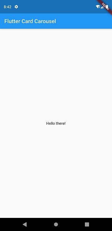
Now, navigate to your main.dart file and delete everything that’s there and replace it with this barebones Hello World script. Notice that we are importing carousel_slider.dart at the top of the file:
**import **'package:flutter/material.dart';
**import **'package:carousel_slider/carousel_slider.dart';

void main() {
runApp(MyApp());
}

class MyApp extends StatelessWidget {
  @override
  Widget build(BuildContext context) {
    return MaterialApp(
      title: 'Flutter Card Carousel App',
      theme: ThemeData(
        primarySwatch: Colors.blue,
      ),
      home: Center(child:Text("Hello there!")),
    );
  }
}
You can run the app now by pressing F5. The app would look like this:
Let’s begin implementing the carousel feature. Firstly convert your MyApp class to StatefulWidget by clicking on the MyApp then a bulb will be displayed on its left, later on selecting the bulb to click on ‘change to StatefulWidget’. After this replace your body with a Column that has two children: a CarouselSlider and a Row.
CarouselSlider will be using the list in which we have defined our cards respectively.
body: Column(
  children: <Widget>[
    CarouselSlider(
      items: null
    ),
    Row(
      children: <Widget>[
        Text("data")
      ],
    )
  ],
)
This will throw an error for now, but after defining our parameters in CarouselSlider the app will work. Following are the parameters that we can use in CarouselSlider:
height, aspectRatio, viewportFraction, initialPage, enableInfiniteScroll, reverse, autoPlay, autoPlayInterval, autoPlayAnimationDuration, autoPlayCurve, pauseAutoPlayOnTouch, enlargeCenterPage, onPageChanged, and scrollDirection,
For our case, we will be using the below code for CarouselSlider. Here :
height is the overall height of our cards.
autoPlay is for cards to automatically slide one page at a time.
autoPlayInterval sets Duration to determent the frequency of slides when autoPlay is set to true.
autoPlayAnimationDuration The animation duration between two cards while in auto playback.
autoPlayCurve determines the animation curve.
pauseAutoPlayOnTouch sets a timer on touch detected that pause the autoplay.
aspectRatio is used if no height have been declared.
onPageChanged called whenever the page in the centre of the viewport changes.
CarouselSlider(
  height: 200.0,
  autoPlay: true,
  autoPlayInterval: Duration(seconds: 3),
  autoPlayAnimationDuration: Duration(milliseconds: 800),
  autoPlayCurve: Curves.fastOutSlowIn,
  pauseAutoPlayOnTouch: Duration(seconds: 10),
  aspectRatio: 2.0,
  onPageChanged: (index) {
    setState(() {
      _currentIndex = index;
    });
  },
  items: cardList.map((card){
    return Builder(
      builder:(BuildContext context){
        return Container(
          height: MediaQuery.of(context).size.height*0.30,
          width: MediaQuery.of(context).size.width,
          child: Card(
            color: Colors.blueAccent,
            child: card,
          ),
        );
      }
    );
  }).toList(),
),
Here:
card is used to access cardList items.
.map((card){}) This method returns a view of the mapped elements in the cardList.
Builder is used for creating Card.
N*EW UPDATE: After the new update in the package (carousel_slider: ^2.2.1) the CarouselSlider() is updated to this:*
CarouselSlider(
              options: CarouselOptions(
                height: 200.0,
                autoPlay: true,
                autoPlayInterval: Duration(seconds: 3),
                autoPlayAnimationDuration: Duration(milliseconds: 800),
                autoPlayCurve: Curves.fastOutSlowIn,
                pauseAutoPlayOnTouch: true,
                aspectRatio: 2.0,
                onPageChanged: (index, reason) {
                  setState(() {
                    _currentIndex = index;
                  });
                },
              ),
              items: cardList.map((card){
                return Builder(
                  builder:(BuildContext context){
                    return Container(
                      height: MediaQuery.of(context).size.height*0.30,
                      width: MediaQuery.of(context).size.width,
                      child: Card(
                        color: Colors.blueAccent,
                        child: card,
                      ),
                    );
                  }
                );
              }).toList(),
            ),
Now we will define the _currentIndex and cardList under _MyAppState class.
int _currentIndex=0;

List cardList=[
    Item1(),
    Item2(),
    Item3(),
    Item4()
  ];

List<T> map<T>(List list, Function handler) {
    List<T> result = [];
    for (var i = 0; i < list.length; i++) {
      result.add(handler(i, list[i]));
    }
    return result;
  }
The _currentIndex is the index of card currently being displayed in the slider. And the Item1, Item2, Item3 and Item4 are the list items in the cardList. These items have the content of our cards. These items are defined below:
Item1:
class Item1 extends StatelessWidget {
  const Item1({Key key}) : super(key: key);

@override
  Widget build(BuildContext context) {
    return Container(
      decoration: BoxDecoration(
        gradient: LinearGradient(
          begin: Alignment.topLeft,
          end: Alignment.bottomRight,
          stops: [0.3, 1],
          colors: [Color(0xffff4000),Color(0xffffcc66),]
        ),
      ),
      child: Column(
        mainAxisAlignment: MainAxisAlignment.center,
        children: <Widget>[
          Text(
            "Data",
            style: TextStyle(
              color: Colors.white,
              fontSize: 22.0,
              fontWeight: FontWeight.bold
            )
          ),
          Text(
            "Data",
            style: TextStyle(
              color: Colors.white,
              fontSize: 17.0,
              fontWeight: FontWeight.w600
            )
          ),
        ],
      ),
    );
  }
}
Item2:
class Item2 extends StatelessWidget {
  const Item2({Key key}) : super(key: key);

@override
  Widget build(BuildContext context) {
    return Container(
      decoration: BoxDecoration(
        gradient: LinearGradient(
          begin: Alignment.topLeft,
          end: Alignment.bottomRight,
          stops: [0.3, 1],
          colors: [Color(0xff5f2c82), Color(0xff49a09d)]
        ),
      ),
      child: Column(
        mainAxisAlignment: MainAxisAlignment.center,
        children: <Widget>[
          Text(
            "Data",
            style: TextStyle(
              color: Colors.white,
              fontSize: 22.0,
              fontWeight: FontWeight.bold
            )
          ),
          Text(
            "Data",
            style: TextStyle(
              color: Colors.white,
              fontSize: 17.0,
              fontWeight: FontWeight.w600
            )
          ),
        ],
      ),
    );
  }
}
Item3:
class Item3 extends StatelessWidget {
  const Item3({Key key}) : super(key: key);

@override
  Widget build(BuildContext context) {
    return Container(
      decoration: BoxDecoration(
        gradient: LinearGradient(
          begin: Alignment.topLeft,
          end: Alignment.bottomRight,
          stops: [0.3, 1],
          colors: [Color(0xffff4000),Color(0xffffcc66),]
        ),
      ),
      child: Column(
        mainAxisAlignment: MainAxisAlignment.center,
        children: <Widget>[
          Image.asset(
            'assets/flutter_dev.png',
            height: 180.0,
            fit: BoxFit.cover,
          )
        ],
      ),
    );
  }
}
Item4:
class Item4 extends StatelessWidget {
  const Item4({Key key}) : super(key: key);

@override
  Widget build(BuildContext context) {
    return Container(
      child: Column(
        mainAxisAlignment: MainAxisAlignment.center,
        children: <Widget>[
          Text(
            "Data",
            style: TextStyle(
              color: Colors.white,
              fontSize: 22.0,
              fontWeight: FontWeight.bold
            )
          ),
          Text(
            "Data",
            style: TextStyle(
              color: Colors.white,
              fontSize: 17.0,
              fontWeight: FontWeight.w600
            )
          ),
        ],
      ),
    );
  }
}
Now we define our Row() which will indicate dotted indicator for the slider.
Row(
  mainAxisAlignment: MainAxisAlignment.center,
  children: map<Widget>(cardList, (index, url) {
    return Container(
      width: 10.0,
      height: 10.0,
      margin: EdgeInsets.symmetric(vertical: 10.0, horizontal: 2.0),
      decoration: BoxDecoration(
        shape: BoxShape.circle,
        color: _currentIndex == index ? Colors.blueAccent : Colors.grey,
       ),
     );
   }),
 ),
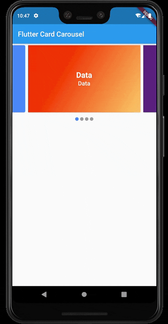
All set. Reload your app and you have a working card carousel.
Source Code:
himanshusharma89/Flutter-Card-Carousel
Thank you for reading, if you enjoyed the article make sure to give a clap (👏)! You can connect with me on Twitter, LinkedIn and find some of my work on GitHub and Codepen. And for more such articles you can support me by buying me a coffee: